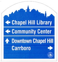
 The need for signs to help people find their way around town has been discussed for several years. The Town of Chapel Hill recently installed their first wayfinding signs. This initial step is welcome, but I'm a little disappointed with the implementation. First of all, I think they are needed downtown much more than at our entryways, which is where the program is currently focused.
A few nights ago I was driving home on MLK Blvd and got my first look at the signs. They appear to be white text on a light blue background, rendering them nearly impossible to read! In addition, the UNC branding would seem to indicate that these are signs for how to get to the University, rather than to a variety of local destinations. And of course if the signs can't be read from a moving car, then they aren't doing much good on a 5-lane road.

